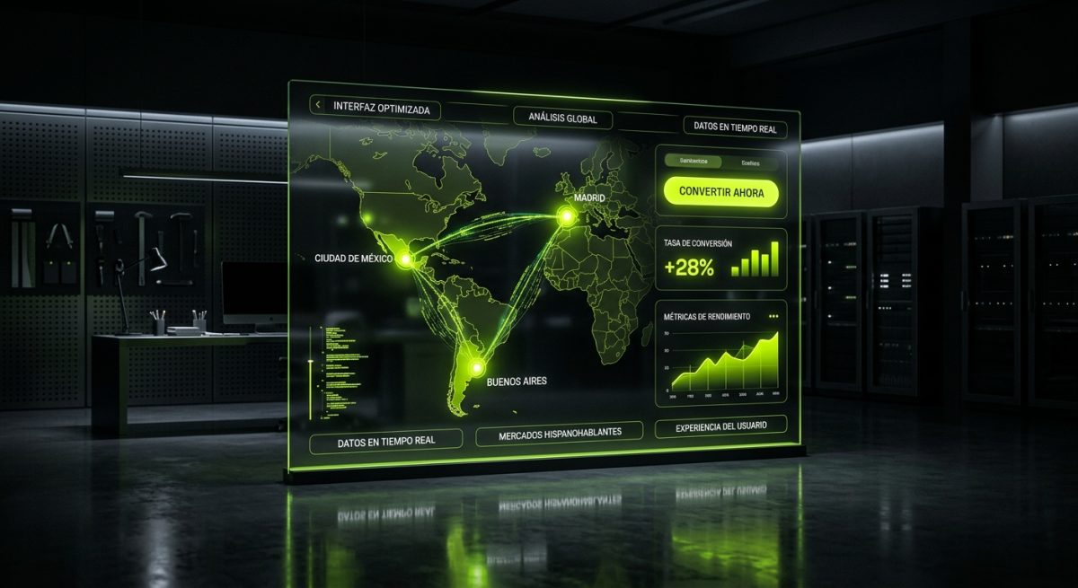
Building a website that converts visitors into customers is never a one-size-fits-all endeavor. When your target audience spans Spanish-speaking markets — from Mexico City to Buenos Aires, from Madrid to Miami — the design decisions you make carry cultural, linguistic, and behavioral weight that generic UX frameworks simply don't account for. A layout that drives purchases in the United States can quietly bleed conversions when deployed without adaptation across Latin America or Spain.
This post breaks down the specific UX/UI strategies that move the needle for Spanish-speaking audiences, drawing on conversion rate optimization principles, regional behavioral data, and practical implementation patterns for WordPress, Webflow, and Shopify projects.
Understanding the Cultural and Behavioral Context Behind Conversions
Conversion-focused design starts with understanding why people hesitate. In Spanish-speaking markets, hesitation is often rooted in trust, relationship, and social proof — values that are structurally more prominent in collectivist cultures than in the individualistic frameworks that dominate North American UX research.
Trust as a Design Element
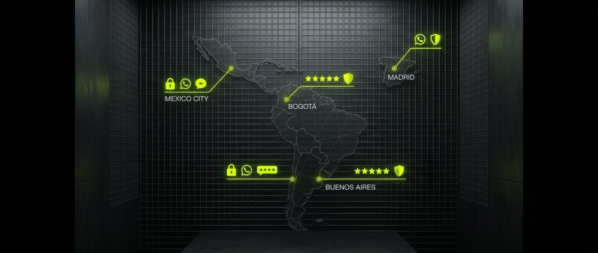
In markets like Mexico, Colombia, Argentina, and Spain, trust signals carry disproportionate weight in purchase decisions. This isn't abstract — it manifests in measurable ways:
- Payment security badges placed above the fold reduce cart abandonment significantly more than in U.S. markets, where users have higher baseline trust in e-commerce infrastructure.
- Named testimonials with photos and city/country identifiers outperform anonymous reviews. A testimonial from "Carlos M., Monterrey" converts better than "Satisfied Customer."
- WhatsApp contact buttons are not optional extras — they are primary trust anchors. In Latin America, WhatsApp has a 93%+ penetration rate among smartphone users, and the presence of a visible WhatsApp CTA signals that a real person is reachable.
- Company registration numbers and physical addresses in footers reduce bounce rates on B2B landing pages, particularly in markets with higher skepticism toward online-only businesses.
Reading Patterns and Visual Hierarchy
Spanish text is, on average, 15–25% longer than equivalent English content. This has direct implications for button sizing, hero headline layouts, and mobile truncation. Designs built with English placeholder text and then translated without layout adjustment frequently produce broken visual hierarchies — truncated CTAs, overflowing cards, and misaligned grids.
The fix is not simply wider buttons. It requires:
- Fluid typography that scales gracefully with longer strings
- CTA copy that prioritizes action verbs — "Obtén tu presupuesto" (Get your quote) over "Solicitar información" (Request information) — because the former reduces perceived friction
- F-pattern and Z-pattern layouts that account for reading flow in languages with longer word lengths, particularly on mobile where line breaks occur more frequently
Mobile-First Is Non-Negotiable
Mobile internet penetration across Latin America exceeds 70% in most major markets, and in countries like Mexico and Brazil, mobile accounts for over 65% of all e-commerce traffic. Spain mirrors this trend, with mobile sessions consistently outpacing desktop across retail and service verticals.
This means that conversion optimization for Spanish-speaking markets is, functionally, mobile conversion optimization. Designs that treat mobile as a secondary viewport — responsive afterthoughts rather than primary design surfaces — systematically underperform. Every CTA placement, form field count, and image compression decision must be evaluated through a mobile-first lens before desktop considerations enter the conversation.
CTA Architecture and Micro-Copy That Drives Action

Call-to-action design is where cultural nuance translates most directly into revenue. The words, placement, color, and surrounding context of a CTA are not decorative decisions — they are the final gate between interest and conversion. In Spanish-speaking markets, several patterns consistently outperform generic approaches.
Language Register and Formality
Spanish has two registers of address: tú (informal) and usted (formal). The choice between them is not arbitrary — it signals the relationship your brand is proposing with the user.
- B2C e-commerce and consumer apps perform better with tú forms: "Empieza gratis," "Crea tu cuenta," "Personaliza tu pedido." These feel direct and approachable.
- B2B SaaS, legal, financial, and healthcare platforms often benefit from usted in Latin American markets, particularly in Colombia and parts of Argentina: "Solicite una demostración," "Contáctenos hoy."
- Spain specifically has a stronger cultural norm around tuteo (informal address) even in professional contexts, so B2B platforms targeting Spanish audiences may safely use tú forms without losing credibility.
Mismatching register to audience creates subtle friction that users can't always articulate but feel as a brand misalignment — and it suppresses conversions quietly.
Reducing Perceived Risk in CTAs
High-converting CTAs in these markets frequently include risk-reduction micro-copy positioned immediately below or beside the primary button:
[Solicita tu demo gratuita]
Sin compromiso · Respuesta en menos de 24 horas
This pattern works because it addresses the two most common hesitations: cost and time investment. The micro-copy doesn't need to be prominent — 12px gray text beneath a button is sufficient. Its presence alone reduces abandonment.
Other proven micro-copy patterns:
- "Cancela cuando quieras" (Cancel anytime) for subscription flows
- "Más de 3,000 empresas ya confían en nosotros" (Social proof with specificity)
- "Datos protegidos con cifrado SSL" near form fields
Form Design and Field Reduction
Form abandonment is a universal problem, but it's amplified in markets where distrust of data collection is higher. Research across Latin American e-commerce consistently shows that forms with more than 4 fields on mobile see abandonment rates above 68%.
The implementation principle is progressive disclosure:
- Step one: Capture only email or phone number (WhatsApp number preferred)
- Step two: After micro-commitment, request name and company
- Step three: Qualification questions appear only after explicit opt-in
In Shopify, this maps to optimized checkout flows with guest checkout prominently surfaced. In WordPress with WooCommerce, it means stripping the default checkout form to essentials and using conditional logic to reveal fields only when necessary. In Webflow, custom form interactions can implement this progressively with native interactions and CMS-driven logic.
Color Psychology in Regional Context
Color associations are not universal. While red urgency signals (countdown timers, "Only 3 left") translate reasonably well across markets, the primary brand color palette carries different connotations:
- Green is strongly associated with money and success across Latin America, making it an effective CTA color for financial products
- Yellow and orange perform well for consumer goods and food-adjacent brands in Mexico and Central America
- Deep blue and navy retain professional authority signals in B2B contexts across all Spanish-speaking markets
- White space is sometimes perceived as incomplete or low-effort in markets accustomed to information-dense layouts — a consideration when adapting minimalist design systems
Technical Implementation Across WordPress, Webflow, and Shopify
Conversion-focused UX decisions only deliver results when implemented correctly at the platform level. Abstract design principles must translate into specific technical patterns depending on the stack your project runs on.
WordPress and WooCommerce
For WordPress sites targeting Spanish-speaking markets, conversion optimization operates at several layers:
Multilingual and regional configuration:
// functions.php — Force Spanish locale for specific regions
add_filter('locale', function($locale) {
    if (isset($_SERVER['HTTP_CF_IPCOUNTRY'])) {
        $country = $_SERVER['HTTP_CF_IPCOUNTRY'];
        $latin_america = ['MX', 'CO', 'AR', 'CL', 'PE', 'VE'];
        if (in_array($country, $latin_america)) {
            return 'es_MX';
        } elseif ($country === 'ES') {
            return 'es_ES';
        }
    }
    return $locale;
});
This pattern, combined with Cloudflare's geolocation headers, allows a single WordPress installation to serve regionally appropriate Spanish variants — critical because "es_MX" and "es_ES" locale files produce different date formats, currency separators, and even some UI strings that affect perceived professionalism.
WooCommerce checkout optimization:
- Remove the "Company name" field unless B2B-focused (reduces cognitive load)
- Set WhatsApp order confirmation via WooCommerce hooks using the Twilio API or WATI integration
- Implement local payment gateways: Conekta and OpenPay for Mexico, Mercado Pago for Argentina/Colombia/Chile, Redsys for Spain
Local payment method availability is not a nice-to-have — it is a primary conversion lever. Mercado Pago's installment options ("Meses sin intereses" in Mexico, "Cuotas" across South America) can increase average order value by 30–40% when surfaced correctly at checkout.
Page speed for Latin American infrastructure:
Many Latin American users connect through mobile networks with higher latency than North American or European baselines. Core Web Vitals targets should be adjusted accordingly:
- LCP under 2.5s on 4G connections, not just fiber
- Use Cloudflare's Latin American PoPs (São Paulo, Bogotá, Santiago) for CDN distribution
- Lazy-load all images below the fold; hero images should be WebP with AVIF fallback
Webflow
Webflow's visual development model makes it well-suited for rapid iteration on conversion-focused layouts, but Spanish-speaking market optimization requires specific configuration:
Text overflow handling:
Webflow's default text styles frequently break with longer Spanish strings. The fix involves setting explicit overflow: visible on CTA containers and using word-break: break-word as a fallback:
.cta-button {
  white-space: normal;
  word-break: break-word;
  overflow-wrap: break-word;
  min-width: fit-content;
  padding: 14px 28px;
}
This prevents button text like "Solicita una consultoría gratuita" from truncating on smaller viewports.
Localization with Webflow Localization:
Webflow's native localization feature (available on CMS and Business plans) supports regional Spanish variants. The implementation should:
- Define
es-MXandes-ESas separate locales if the target market spans both - Use locale-specific slug structures (
/es-mx/vs/es/) for SEO clarity - Override CTA micro-copy per locale rather than using direct translation, since conversion-optimized copy often requires cultural adaptation beyond word-for-word translation
Shopify
Shopify's ecosystem has matured significantly for Spanish-speaking markets, particularly following the growth of Latin American e-commerce post-2020.
Theme and checkout localization:
Shopify Markets (available on all plans) allows merchants to configure regional pricing, currency, and language per market. For Spanish-speaking audiences:
- Enable local currency display: Mexican Peso (MXN), Colombian Peso (COP), Argentine Peso (ARS), Euro (EUR for Spain)
- Configure Shopify Payments or local alternatives per market — Shopify Payments is not available in all Latin American countries, making third-party gateway configuration essential
- Use Shopify's built-in translation editor to adapt checkout strings beyond auto-translation, focusing on CTA copy and error messages
Trust signal implementation in Liquid:
{% comment %} Add regional trust badges based on market {% endcomment %}
{% if localization.market.handle == 'mexico' %}
  <div class="trust-badges">
    <img src="{{ 'conekta-badge.svg' | asset_url }}" alt="Pago seguro con Conekta">
    <img src="{{ 'ssl-badge.svg' | asset_url }}" alt="Sitio seguro SSL">
    <a href="https://wa.me/521XXXXXXXXXX" class="whatsapp-cta">
      <img src="{{ 'whatsapp-icon.svg' | asset_url }}" alt="Contáctanos por WhatsApp">
      Soporte por WhatsApp
    </a>
  </div>
{% endif %}
This pattern surfaces market-specific trust signals without cluttering the global theme, keeping the codebase maintainable while delivering regionally relevant conversion elements.
Product page conversion patterns:
For Spanish-speaking markets, product pages should surface:
- Installment pricing prominently ("3 meses sin intereses" or "12 cuotas sin recargo")
- Estimated delivery by region, not just generic timeframes
- WhatsApp product inquiry link for high-consideration purchases
- Reviews filtered or labeled by country of origin when available
The combination of these elements addresses the trust, affordability, and accessibility concerns that most frequently suppress conversions in these markets — and they can be implemented systematically across any Shopify store with well-structured Liquid templates and a clear localization strategy.